Wednesday, 9 February 2011

Texture Mapping

This is a map of a house model in 3ds Max.
In Chris's lesson today we were asked to make a basic texture in Photoshop and then add that texture to a ready made model in 3DS-Max. This was done by using a map of the 3d model as shown in the image to the left.
I then copied and pasted textures found on Google images into Photoshop and scaled them to fit within the model map. Each texture is supposed to resemble the materials often used in houses.
Once we had made our texture we saved the Photoshop image in JPEG format then went back onto 3DS-Max.


Here is the textured model in 3DS-Max.
 In 3DS-Max we used the material editor tool to add the mapped out texture onto the house model. We did this by selecting Defuse tool choosing the Bitmap option then selecting the JPEG image we had made earlier. Then simply clicked the icon that looks like a Rubik cube to show the standard map in the view port. Then we just drag and drop the texture onto the model and then everything fits according to the map we created. This is a very basic and useful way of texturing models of course there is alot that be expanded on in this topic. We could add windows and many different textures to achieve more depth and realism with our     3D models.

Wednesday, 26 January 2011

Corridor of Light

In Chris lesson we experimented further with the use of spotlights in a 3d enviroment. By making a corridor out of a box then making spotlights emit from lamps we had made. Once we had made a single spotlight emit the wayght to we wanted it. We simply duplicated the spotlight so that the entire corridor was luminated.  

Wednesday, 19 January 2011

3DS-Max: Lighting

In today's lesson with Chris we learned about how to add lighting effects within 3ds-max. The actual light has many different options for the user to tweak to their exact specifications. Such as the intensity of the light, the direction of the light, colour of the light, whether the light defuses over a certain amount of distance. Along with many other options to explore. Here are some examples...

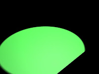
Here is a green light shinning diagonally across a black plane. It doesn't look very real but in this example l increased the intensity of the light and changed the direction. So that it it wasn't just a green circle and so that it does in a way resemble a spotlight shining across the ground.    


Here is a simple black sphere with a very small reflection on top of it. I had tried to make the sphere appear shiny and resemble an 8 ball. Ligting can be used for these kind of shimmering effects. To add that much more depth to your models.

Here is a tube with light shinging into it the coming out the other end and affecting the small squares behind it. This may be used for when light is coming though a small hole or maybe though a window.

I still need alot of practice with 3ds max -_-

Wednesday, 5 January 2011

Giant Mech concept art

Here is is a sketch l did of a robot attacking a city. With Chris l scanned the original image into Photoshop and tweaked the brightness and contrast to make the lines darker and more like a comic. Which was the style l was aiming for. I then came up with the idea of putting rays in the background to draw attention to the robot. I did this by using the flower shape found in the autoshapes. Then used the Mask tool to place it in the background parts of the shape were missing but l thought that made it look cool.

Wednesday, 10 November 2010

3d Max Space Ship

In todays lesson Chris showed us a way to make a space ship although mine doesnt show up very well when l render it. Actually neraly half of it goes when l render it but oh well. I really need to practice more with using 3ds Max im really bad at it.


Thursday, 4 November 2010

Desktop project evaluation


Here is my evaluation presentation for my desktop project l think Ive included everything if not please let me know.

Wednesday, 27 October 2010

Desktop final UPDATED

Over the last six weeks we have been working on our assignment. Which was to design and create our own desktop image. We started of by making four different ideas (you can see mine in one of my earlier posts). Using my design ideas l made a final image and it looked god awful so l made another design during the reading week. Here is how it started off...
My idea was to have a silhouette, manga style character in front of a moon in some sort of field. 
I thought this design looked a bit basic and boring so l worked on it some more. This time l tried to make a more realistic sky and moon. Here is what l did... 
Using the "Render tool in Gimp (my photoshop wouldn't work -_-). I made the texture of the moon and sky. Then to make the stars, grass and butterfly's. I used photoshop brush's l downloaded off "Deviantart".
I'm really pleased with how this turned out. I learned how to do this by watching someone make a planet in Gimp then l just changed the colour made a few tweaks using the "Warp" tool. Then l got something that kinda looks like a real moon. 
Now moving onto the character in google images l found a picture of a samurai that looked awesome. Only problem was in the image he was just stood up straight and l wanted him to be running across the picture. So using the image as reference l sketched a few rough ideas of different poses. Then worked on a final design it took me a few tries but eventually l did something l was happy with.
Then l added the character and background together tweaked the brightness worked a bit more on the night sky then l was finished. Ive really enjoyed working on this assignment  and hope my work is to a good enough standard. Feel free to put what you think in the comments thing not enough people do that.