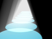
 In Chris lesson we experimented further with the use of spotlights in a 3d enviroment. By making a corridor out of a box then making spotlights emit from lamps we had made. Once we had made a single spotlight emit the wayght to we wanted it. We simply duplicated the spotlight so that the entire corridor was luminated.
Wednesday, 26 January 2011
Corridor of Light
 In Chris lesson we experimented further with the use of spotlights in a 3d enviroment. By making a corridor out of a box then making spotlights emit from lamps we had made. Once we had made a single spotlight emit the wayght to we wanted it. We simply duplicated the spotlight so that the entire corridor was luminated.
Wednesday, 19 January 2011
3DS-Max: Lighting
In today's lesson with Chris we learned about how to add lighting effects within 3ds-max. The actual light has many different options for the user to tweak to their exact specifications. Such as the intensity of the light, the direction of the light, colour of the light, whether the light defuses over a certain amount of distance. Along with many other options to explore. Here are some examples...
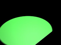 Here is a green light shinning diagonally across a black plane. It doesn't look very real but in this example l increased the intensity of the light and changed the direction. So that it it wasn't just a green circle and so that it does in a way resemble a spotlight shining across the ground.
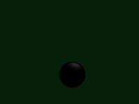
Here is a simple black sphere with a very small reflection on top of it. I had tried to make the sphere appear shiny and resemble an 8 ball. Ligting can be used for these kind of shimmering effects. To add that much more depth to your models.
Here is a tube with light shinging into it the coming out the other end and affecting the small squares behind it. This may be used for when light is coming though a small hole or maybe though a window.
I still need alot of practice with 3ds max -_-
 Here is a green light shinning diagonally across a black plane. It doesn't look very real but in this example l increased the intensity of the light and changed the direction. So that it it wasn't just a green circle and so that it does in a way resemble a spotlight shining across the ground.
 Here is a simple black sphere with a very small reflection on top of it. I had tried to make the sphere appear shiny and resemble an 8 ball. Ligting can be used for these kind of shimmering effects. To add that much more depth to your models.
Here is a tube with light shinging into it the coming out the other end and affecting the small squares behind it. This may be used for when light is coming though a small hole or maybe though a window.
I still need alot of practice with 3ds max -_-
Wednesday, 5 January 2011
Giant Mech concept art
Here is is a sketch l did of a robot attacking a city. With Chris l scanned the original image into Photoshop and tweaked the brightness and contrast to make the lines darker and more like a comic. Which was the style l was aiming for. I then came up with the idea of putting rays in the background to draw attention to the robot. I did this by using the flower shape found in the autoshapes. Then used the Mask tool to place it in the background parts of the shape were missing but l thought that made it look cool.
Subscribe to:
Comments (Atom)
