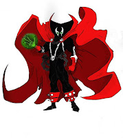
During my storyboard design process l encountered some problems. One in particular was the fact l made the workload to big by planning to do numerous pages in my comic. So l ended up just doing a single page of my original plan without the intro since it still sort off made sense when l started from that point in the story.
At this point my character Spawn had gone though a portal into a cartoon world where eveything is over simplified including himself. Here is the draft version of my uncoloured storyboard.
This is just the basic lineart that has yet to be tidyed up and colored in Photoshop. This was originally the second and last page of my comic. Though it is very basic l plan to spice it up a bit in Photoshop with a few added effects.
Comparison to Professional Work
Though this storyboard doesnt show of the best of my drawing ability l think that the nice, simple design fits the overall theme of a child themed world. I will compare this to the existing Spawn comics to show how my character holds similarities but also has differences in his appearence.
For my comic panels l treid to replicate the comic style as best as l could whilst still keeping to the simplistic design. Instead of just square panels next to each other. I experimented with different shapes and sizes depending on the currant scene. The more important scenes are larger than the dialoge one's. The draft vesion still needs speech bubles applied to it. I left room at the side of most panels. But on some l intend to have the speech bubble slide out off the panel much like the actual Spawn comics do. In Spawn characters actually reach out of the set panel which gives it more depth to the viewer.
Character Designs
For my original idea l planned to have Spawn sent from his usual comic world into the cartoon world ahead. This meant he was supposed to look like his original self at the beginning of the comi. So l had to make two designs of Spawn one normal, one cartoon. As you can see below.
 Here is Spawn as he originally looks l planned to draw the first page to the best of my ability in order to replicate the actual Spawn comics. I never did this as it was just too much work. So l completly scrapped the idea and just focused on the 2nd more simplistic page.
 Here is the cartoon version of Spawn that l used. This holds a great deal of inspiration from my icons work in particular the War one. Which was a soldier of similar desing with simplied features and build. I mean things like the triangle arms etc. If you look at the original character you can see that this version still holds the key features. That define the character mainly the colur theme and cape. I would hope that anyone who knows the character would know that this is a spoof of that character.
Final Coloured Version
*waiting*


No comments:
Post a Comment