In Chris's lesson today we looked at analogue recording methods over digital. Analogue sound is a higher quality debatably because the record uses vibrations to create real physical sound which is then amplified this sound is more natural to us humans.
The sound is played because different wave lengths are scribed onto a surface as a physical texture which cause vibrations in the needle which then produces the correct wavelength which is amplified for us to hear. This is the method used for record players that use a needle to play the sound from a disc.
Another analogue recording method uses magnetic tape rather than a vinyl disc used for record players. To record the quality sounds the thicker the tape and how slowly it is winded define the quality of the sound slower and thicker means better quality unlike modern CD recordings.
Tuesday, 29 November 2011
Tuesday, 22 November 2011
Trailer Anaylysis
Today we dicussed as a group what to include in our game trailer by listing key points on a spider diagram. First we listed what was common in most trailers like team logos, age ratings, release date things that should be included by default and make up our teams identity.

Sound Unit
Today in Chris's lesson we looked at different ways of creating sounds in games and other forms of media. The two main techniques involve recording live sound with a recorder or synthesising sounds with computer software.
Examples we looked at were the movie Star Wars and how the producers recorded various machinery sounds to create a believable atmosphere through sounds. Foley artists is the official name given to these sound producers how record and edit sound.
Examples we looked at were the movie Star Wars and how the producers recorded various machinery sounds to create a believable atmosphere through sounds. Foley artists is the official name given to these sound producers how record and edit sound.
Tuesday, 8 November 2011
In today's lesson we discussed out mutual reactions to different music and discussed our feelings and why we may have reacted in that way. We listened to six very different songs but all seemed to get similar vibes in terms of what we thought of each song. Here are my recorded thoughts on each song...
Pumped up- Very fast paced to emphasize action, aggression etc.
Tuesday, 18 October 2011
Unit 6: Saltaire Research
From this research l learnt that not everyone is compliant to give up their time to answer a few questions. Mostly because they are too busy or simply do not want to do it. However most did agree to fill in the questionnaire either carefully or as quickly as possible. I found myself selectively picking potential people who l think would take the questionnaire seriously. People like teachers, members of staff, ones that would treat the questionnaire as actual course work. Though l think we managed to get at least one of every age group specified on the questionnaire though it was primarily 17-20 year olds. Because we asked allot of students to fill out the forms.
In the way of team organisation we simply split into pairs each with some of the questionnaire sheets and went to get them filled in. I got most of mine from the college resource centre. Where l managed to get a few 30+ age questionnaires filled.
For the questionnaire itself we used Alex J's template.l It didn't really matter who's we used since we all had similar questions. So we just added necessary ones to Alex's template and used that. Though when we were out getting them filled in. We started to notice numerous mistakes such as repeated questions and questions not everyone will understand. From this l have learnt to pick questions carefully and make them understandable by everyone or provide sufficient explanation.
As for the outcome of the results it was to be honest as expected mostly 17-20, Roberts Park being the most popular location. We have also acquired allot of useless information with these questionnaires we cant actually use.
Overall l think we could have done allot better with the quality of information gathered but what we have will do. Things that could be improved would be only use multiple choice questions. We had questions where the applicant could write their own opinion in their own words. Not many were willing to properly fill this out or just put a silly answer. To effectively gather and record information in a spreadsheet you need to have multiple choice questions. You can not record opinions into a spreadsheet as a result we scrapped these answers entirely.
For this project based on the research l don't really want to base our project on Roberts Park since there aren't many interesting buildings there save for the cafe and statue. I would much rather make the Salts building in a futuristic theme. Not sci-fi kind off future more like how l imagine Saltaire will be 100 years from now. Technology will have advanced but at a realistic and believable level.
For this project based on the research l don't really want to base our project on Roberts Park since there aren't many interesting buildings there save for the cafe and statue. I would much rather make the Salts building in a futuristic theme. Not sci-fi kind off future more like how l imagine Saltaire will be 100 years from now. Technology will have advanced but at a realistic and believable level.
Monday, 26 September 2011
Logo Production
I was away for that particular day and the logo was chosen in my absence. I still produced my logo for my chosen team name which was "LandShark". We started off with a simple spider diagram to record any ideas our team put forth we each came up with three possible team names each. Mine being "OverZealous", "Orkz", and "LandShark". My chosen name was "Overzealous" but l was unable to think of any logo designs that went well with the name so l focused on "LandShark" instead.

Here are the initial concept sketches l did for my company names as you can see they all reference the name at hand which ls what l aim to achieve with the final design. After the sketch and some font experimentation its time to draw my final version.
 This was my final design to the team name "LandShark" you can see it ties in well with the theme. I will tidy up this image and to add font later on. This was simply taken from the concept sheet and tweaked in Photoshop as well as being colored. I'm debating as to whether it is too complicated to be an effective logo for the team. But l also like the comedic value it holds to make it eye catching.

Here are the initial concept sketches l did for my company names as you can see they all reference the name at hand which ls what l aim to achieve with the final design. After the sketch and some font experimentation its time to draw my final version.

Tuesday, 28 June 2011
Unit 69-Storyboard Development
The Plan
During my storyboard design process l encountered some problems. One in particular was the fact l made the workload to big by planning to do numerous pages in my comic. So l ended up just doing a single page of my original plan without the intro since it still sort off made sense when l started from that point in the story.
At this point my character Spawn had gone though a portal into a cartoon world where eveything is over simplified including himself. Here is the draft version of my uncoloured storyboard.

This is just the basic lineart that has yet to be tidyed up and colored in Photoshop. This was originally the second and last page of my comic. Though it is very basic l plan to spice it up a bit in Photoshop with a few added effects.
Comparison to Professional Work
Though this storyboard doesnt show of the best of my drawing ability l think that the nice, simple design fits the overall theme of a child themed world. I will compare this to the existing Spawn comics to show how my character holds similarities but also has differences in his appearence.

For my comic panels l treid to replicate the comic style as best as l could whilst still keeping to the simplistic design. Instead of just square panels next to each other. I experimented with different shapes and sizes depending on the currant scene. The more important scenes are larger than the dialoge one's. The draft vesion still needs speech bubles applied to it. I left room at the side of most panels. But on some l intend to have the speech bubble slide out off the panel much like the actual Spawn comics do. In Spawn characters actually reach out of the set panel which gives it more depth to the viewer.
Character Designs
For my original idea l planned to have Spawn sent from his usual comic world into the cartoon world ahead. This meant he was supposed to look like his original self at the beginning of the comi. So l had to make two designs of Spawn one normal, one cartoon. As you can see below.
 Here is Spawn as he originally looks l planned to draw the first page to the best of my ability in order to replicate the actual Spawn comics. I never did this as it was just too much work. So l completly scrapped the idea and just focused on the 2nd more simplistic page.

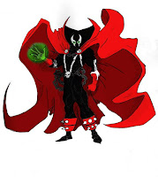
Here is the cartoon version of Spawn that l used. This holds a great deal of inspiration from my icons work in particular the War one. Which was a soldier of similar desing with simplied features and build. I mean things like the triangle arms etc. If you look at the original character you can see that this version still holds the key features. That define the character mainly the colur theme and cape. I would hope that anyone who knows the character would know that this is a spoof of that character.
Final Coloured Version
*waiting*
During my storyboard design process l encountered some problems. One in particular was the fact l made the workload to big by planning to do numerous pages in my comic. So l ended up just doing a single page of my original plan without the intro since it still sort off made sense when l started from that point in the story.
At this point my character Spawn had gone though a portal into a cartoon world where eveything is over simplified including himself. Here is the draft version of my uncoloured storyboard.
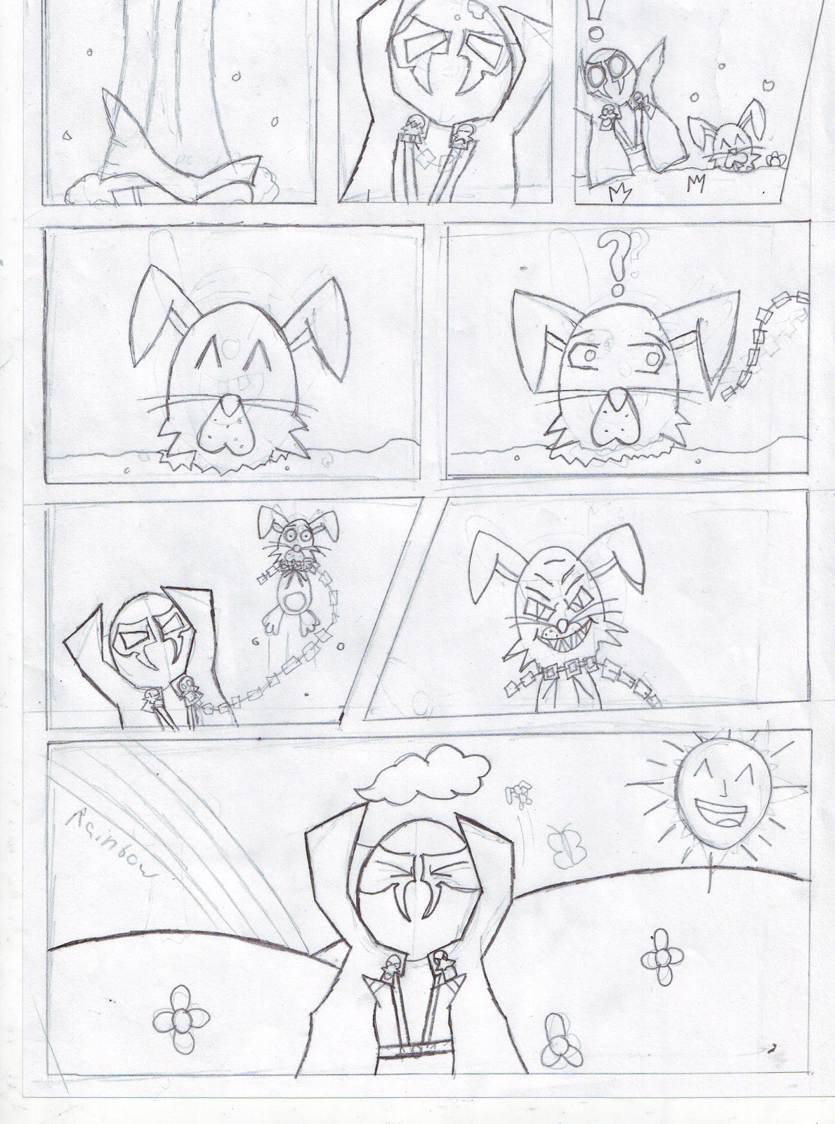
This is just the basic lineart that has yet to be tidyed up and colored in Photoshop. This was originally the second and last page of my comic. Though it is very basic l plan to spice it up a bit in Photoshop with a few added effects.
Comparison to Professional Work
Though this storyboard doesnt show of the best of my drawing ability l think that the nice, simple design fits the overall theme of a child themed world. I will compare this to the existing Spawn comics to show how my character holds similarities but also has differences in his appearence.

For my comic panels l treid to replicate the comic style as best as l could whilst still keeping to the simplistic design. Instead of just square panels next to each other. I experimented with different shapes and sizes depending on the currant scene. The more important scenes are larger than the dialoge one's. The draft vesion still needs speech bubles applied to it. I left room at the side of most panels. But on some l intend to have the speech bubble slide out off the panel much like the actual Spawn comics do. In Spawn characters actually reach out of the set panel which gives it more depth to the viewer.
Character Designs
For my original idea l planned to have Spawn sent from his usual comic world into the cartoon world ahead. This meant he was supposed to look like his original self at the beginning of the comi. So l had to make two designs of Spawn one normal, one cartoon. As you can see below.
 Here is Spawn as he originally looks l planned to draw the first page to the best of my ability in order to replicate the actual Spawn comics. I never did this as it was just too much work. So l completly scrapped the idea and just focused on the 2nd more simplistic page.
Here is the cartoon version of Spawn that l used. This holds a great deal of inspiration from my icons work in particular the War one. Which was a soldier of similar desing with simplied features and build. I mean things like the triangle arms etc. If you look at the original character you can see that this version still holds the key features. That define the character mainly the colur theme and cape. I would hope that anyone who knows the character would know that this is a spoof of that character.
Final Coloured Version
*waiting*
Wednesday, 1 June 2011


Monday, 9 May 2011


Wednesday, 13 April 2011
Planning for my 3-D Render
Unit 66
For Chris's lesson we were tasked with designing our own vehicle from our imagination. By effectively planning the design though concept sketch's, mind maps and eventually building a model of the design in 3DS-Max. So this means l will have to go though each stage of planning to make sure l know what l am aiming for when it comes to the final model. I am aiming to make my design manageable for my currant skill set meaning l want a design that's actually possible to make but is a challenge at the same time.
Mind Map
Here is a mind map l created to explore different ideas and themes with my design. I tried to include as much variety as possible in the suggestions l wrote down. Because from the start l wanted to create a mech model but this may prove to be too difficult. So a backup design would be necessary if my design should prove to be too difficult. For example l included spaceships and different themes that could be applied to these veicles to give them a purpose that can be regonized. Meaning if l added a red texture to a spaceship viewers would get the impression that the ship is some sort of future fire engine. This l hope will show creative and independant thinking in my design. When it comes to actually producing my work there are many example of models that l could take reference from when building my model. All over the internet there are websites ebtirely dedicated to showcasing 3D veicle models to the public offereing advice to beginers on how to make thier own.
Insert Picture Here
MoodBoard
As part off the planning phase we had to include professional examples of other peoples work to take inspiration from. These example were to be presented in a visually appealing way this can be done by using a moodboard. A mood board is just a compilation of revevant images all of which display content that is helpful to you. For mine l included reletivly simplified models without too many pesky details such as bolt's, guns anuthing that obsrtucted the overall shape off the model. As l am aiming to just model the basic shape of my design and if l have time have a go at adding smaller details.

Concept Designs
This is the main phase of planning a design. The purpose of a concept design is visually represent your idea allowing you to see your design more clearly. Here are some concept sketchs l did to further explore my ideas. I did actually draw alot more than what is shown here but l picked out the designs which l thought would be worth the most. Meaning ones l would actually like to model. I tried my best to illustrate a range of ideas instead of just doing my usual habit of drawing mechs. I have included spaceships, mechs, future tanks lots of different ideas for me to choose from. When drawing these designs l tried my best to keep in mind how l was actually going to model these. So l made the models out of as many basic shapes as possible then added detail to make it look better but the basic shape is stil noticable. From these designs it took me a while to decide on a final design as there were many designs that l knew l could draw clearly but wasnt confident l could actually build them in 3ds-Max. I don't believe that l am very talented when it comes to 3DS-Max so l will have to choose my design carefully.
Insert Image Here
Final Design
After all my planning l decided upon a final design. As you can see in the image below the model is almost entirely built of spherical objects. By using this common them l thought that l would manage to actually model the design due to it's simplistic build.
Insert Image Here
When designing a model it is important to show every viewpoint since a drwing is 2 diemensional and a model is obviously 3 diemensional. Of course you cant draw out every single possible angle on your design you would be there forever. Instead you simply draw 4 different viewports Front, Side, Back and Top. Just these 4 will illustrate a clear representation of your design and fully preparing you for the task ahaead which is actually modelling your design.
For Chris's lesson we were tasked with designing our own vehicle from our imagination. By effectively planning the design though concept sketch's, mind maps and eventually building a model of the design in 3DS-Max. So this means l will have to go though each stage of planning to make sure l know what l am aiming for when it comes to the final model. I am aiming to make my design manageable for my currant skill set meaning l want a design that's actually possible to make but is a challenge at the same time.
Mind Map
Here is a mind map l created to explore different ideas and themes with my design. I tried to include as much variety as possible in the suggestions l wrote down. Because from the start l wanted to create a mech model but this may prove to be too difficult. So a backup design would be necessary if my design should prove to be too difficult. For example l included spaceships and different themes that could be applied to these veicles to give them a purpose that can be regonized. Meaning if l added a red texture to a spaceship viewers would get the impression that the ship is some sort of future fire engine. This l hope will show creative and independant thinking in my design. When it comes to actually producing my work there are many example of models that l could take reference from when building my model. All over the internet there are websites ebtirely dedicated to showcasing 3D veicle models to the public offereing advice to beginers on how to make thier own.
Insert Picture Here
MoodBoard
As part off the planning phase we had to include professional examples of other peoples work to take inspiration from. These example were to be presented in a visually appealing way this can be done by using a moodboard. A mood board is just a compilation of revevant images all of which display content that is helpful to you. For mine l included reletivly simplified models without too many pesky details such as bolt's, guns anuthing that obsrtucted the overall shape off the model. As l am aiming to just model the basic shape of my design and if l have time have a go at adding smaller details.

The aim of a mood board is to present example in a fasionable way thats why l added a nice background
along with the modesl. To make it look interesting and actually want to take reference from.
This is the main phase of planning a design. The purpose of a concept design is visually represent your idea allowing you to see your design more clearly. Here are some concept sketchs l did to further explore my ideas. I did actually draw alot more than what is shown here but l picked out the designs which l thought would be worth the most. Meaning ones l would actually like to model. I tried my best to illustrate a range of ideas instead of just doing my usual habit of drawing mechs. I have included spaceships, mechs, future tanks lots of different ideas for me to choose from. When drawing these designs l tried my best to keep in mind how l was actually going to model these. So l made the models out of as many basic shapes as possible then added detail to make it look better but the basic shape is stil noticable. From these designs it took me a while to decide on a final design as there were many designs that l knew l could draw clearly but wasnt confident l could actually build them in 3ds-Max. I don't believe that l am very talented when it comes to 3DS-Max so l will have to choose my design carefully.
Insert Image Here
Final Design
After all my planning l decided upon a final design. As you can see in the image below the model is almost entirely built of spherical objects. By using this common them l thought that l would manage to actually model the design due to it's simplistic build.
Insert Image Here
When designing a model it is important to show every viewpoint since a drwing is 2 diemensional and a model is obviously 3 diemensional. Of course you cant draw out every single possible angle on your design you would be there forever. Instead you simply draw 4 different viewports Front, Side, Back and Top. Just these 4 will illustrate a clear representation of your design and fully preparing you for the task ahaead which is actually modelling your design.
Wednesday, 9 February 2011
Texture Mapping
 |
| This is a map of a house model in 3ds Max. |
I then copied and pasted textures found on Google images into Photoshop and scaled them to fit within the model map. Each texture is supposed to resemble the materials often used in houses.
Once we had made our texture we saved the Photoshop image in JPEG format then went back onto 3DS-Max.
 | |
| Here is the textured model in 3DS-Max. |
Wednesday, 26 January 2011
Corridor of Light
 In Chris lesson we experimented further with the use of spotlights in a 3d enviroment. By making a corridor out of a box then making spotlights emit from lamps we had made. Once we had made a single spotlight emit the wayght to we wanted it. We simply duplicated the spotlight so that the entire corridor was luminated.
Wednesday, 19 January 2011
3DS-Max: Lighting
In today's lesson with Chris we learned about how to add lighting effects within 3ds-max. The actual light has many different options for the user to tweak to their exact specifications. Such as the intensity of the light, the direction of the light, colour of the light, whether the light defuses over a certain amount of distance. Along with many other options to explore. Here are some examples...
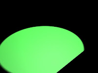 Here is a green light shinning diagonally across a black plane. It doesn't look very real but in this example l increased the intensity of the light and changed the direction. So that it it wasn't just a green circle and so that it does in a way resemble a spotlight shining across the ground.
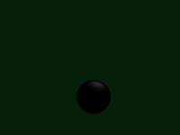 Here is a simple black sphere with a very small reflection on top of it. I had tried to make the sphere appear shiny and resemble an 8 ball. Ligting can be used for these kind of shimmering effects. To add that much more depth to your models.
 Here is a tube with light shinging into it the coming out the other end and affecting the small squares behind it. This may be used for when light is coming though a small hole or maybe though a window.
I still need alot of practice with 3ds max -_-
 Here is a green light shinning diagonally across a black plane. It doesn't look very real but in this example l increased the intensity of the light and changed the direction. So that it it wasn't just a green circle and so that it does in a way resemble a spotlight shining across the ground.

I still need alot of practice with 3ds max -_-
Wednesday, 5 January 2011
Giant Mech concept art
Here is is a sketch l did of a robot attacking a city. With Chris l scanned the original image into Photoshop and tweaked the brightness and contrast to make the lines darker and more like a comic. Which was the style l was aiming for. I then came up with the idea of putting rays in the background to draw attention to the robot. I did this by using the flower shape found in the autoshapes. Then used the Mask tool to place it in the background parts of the shape were missing but l thought that made it look cool.

Subscribe to:
Comments (Atom)