In todays lesson Chris showed us a way to make a space ship although mine doesnt show up very well when l render it. Actually neraly half of it goes when l render it but oh well. I really need to practice more with using 3ds Max im really bad at it.
Wednesday, 10 November 2010
Thursday, 4 November 2010
Desktop project evaluation
Here is my evaluation presentation for my desktop project l think Ive included everything if not please let me know.
Wednesday, 27 October 2010
Desktop final UPDATED
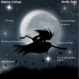
Over the last six weeks we have been working on our assignment. Which was to design and create our own desktop image. We started of by making four different ideas (you can see mine in one of my earlier posts). Using my design ideas l made a final image and it looked god awful so l made another design during the reading week. Here is how it started off...
My idea was to have a silhouette, manga style character in front of a moon in some sort of field.
I thought this design looked a bit basic and boring so l worked on it some more. This time l tried to make a more realistic sky and moon. Here is what l did...
I'm really pleased with how this turned out. I learned how to do this by watching someone make a planet in Gimp then l just changed the colour made a few tweaks using the "Warp" tool. Then l got something that kinda looks like a real moon.
 Now moving onto the character in google images l found a picture of a samurai that looked awesome. Only problem was in the image he was just stood up straight and l wanted him to be running across the picture. So using the image as reference l sketched a few rough ideas of different poses. Then worked on a final design it took me a few tries but eventually l did something l was happy with.
 Then l added the character and background together tweaked the brightness worked a bit more on the night sky then l was finished. Ive really enjoyed working on this assignment and hope my work is to a good enough standard. Feel free to put what you think in the comments thing not enough people do that. 

Wednesday, 20 October 2010
3ds Max animation
Using keyframe animation we added a very basic animation to our text. I like this tool because it is very simple to use and easy to change if you want to add more. Here is what l made...
I added keyframes to each individual letter to create some sort of flowing effect. Then it shoots of screen for some reason.
Using material editor in 3ds Max
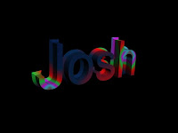
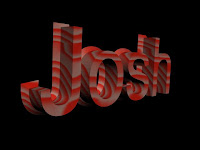
In 3ds Max we all used the text tool to make our name in 2-d you can edit the size and font same as any other program. Then we used the "Extrude" tool to make the text 3-d. Then we used material editor to create textures for the text here are some examples.

 Using the material editer we can even add efects such as "Glossiness", "Specular level" and what colours to use. In the three examples l used "Planet" and "Wood" from the material browser you can however download or create your own material to use. Then l played around with the colour and size.
Wednesday, 13 October 2010
3-D Car Render
Today we have made a car model using 3-ds Max. I found this quite difficult when using the tools to shape the car. It was very easy to make mistakes and my car turned out looking like a complete mess. (So l am going to try it again ill upload a picture soon). Im going to practice using 3-d max when ever l can because im not very good at using it.
Wednesday, 6 October 2010
Desktop design ideas
 I have started to develop my own ideas on paper for my desktop project here are the four designs l came up with.
My first idea was some sort of ball with lots of shapes flowing towards and away from it. I originally planned to keep it simple with only a few shapes but l ended up putting to many on and overcomplicating the image.
My second idea was to have some sort of character to represent "Shipley college" and the "Media Suite". I was supposed to draw some different character designs and stick them on. But l haven't got round to it yet.
My third idea was to have "Shipley college" and "Media suite" in some sort of stylized font. I may include this font idea in my final design. I have added some more pattern to this idea since uploading this photo.
I'm not sure what idea l should use in my final design or whether to include all of them. I will continue to develop ideas until l find one that can be managed.
Building render design
After we made the simple castle render we were set a task to draw our own design for a building that we could make in 3-d max. I made some sort of car park with different levels supported by beams. This was relativly easy to do in 3-d max. Because once you have made the first level you can just use the clone tool to make the rest.
Simple castle render
Today we learned how to use box modeling techniqes and a range of other editing tools to create a simple render of a castle.
We used the Editable mesh, Vertex, Face and edge tools to edit a box into the shape of a castle. Later on we are going to design are our buildings on paper and then try to work them into 3-d max.
Mind map
Today we had to create a mind map using a website call MindMiester it alows you to create your very own mind map using a computer. This is what l made.
Rollover buttons hwk
In our class we are going to learn how to design some rollover buttons. Which are buttons on say a website that do some sort of animation. For example it just changes colour. Whenever the cursor is moved over it. This is useful for creating an attractive look for your website or whatever your doing.
Here are some links to examples:
This is a website that shows you how to make rollovers.
http://www.webdesign.org/photoshop/web-layout/roll-over-buttons.8379.html
Wow these are hard to find.
Here are some links to examples:
This is a website that shows you how to make rollovers.
http://www.webdesign.org/photoshop/web-layout/roll-over-buttons.8379.html
Wow these are hard to find.
First character design
Here is my first attempt at actually creating a character. We started of sketching our idea onto a sheet of a3 then the challenge was to create a 3-d model of that picture. Using only standard and extended primitive shapes. My 3-d render looks abit like my design.
First time using 3-D Max
Today our task was to make our own robot using 3-d max using Standard and Extended primitive shapes. I'm now becoming more familiar using 3-d max and hope to progress further with using the tools available.
Though it looks very basic l will in the future try for a bit more complex shapes to improve my skills using 3-d max. I have learnt how to use simple modeling and editing tools by using standard primitive shapes to create an image and use move, scale, and rotate to get a full view of the render.
What l hope to gain from this course
In this blog l will show what my ambitions are for the future showing what l wish to gain from this course BND Games Development. When l complete this course l want to move on to university to continue my education further. I first applied for this course because when l listened to what new skills we were going to learn alot of them were things l already really wanted to learn etc. Photoshop, Flash Animation, 3-D work. It just sounded perfect for me it was something l was already interested in.
I look forward to being able to use photoshop epecially because l personally love to draw and knowing how to use photoshop will give me even more resources to work with.
Genre collage
This is my genre collage l made in class l have used cutouts from lots of different magazines and put them in the appropriate genre War, Fantasy, Sci-fi and Horror. Some of these images are not from games though a few of them are from very famous movies like Star Wars which fits into the Sci-fi genre or The Thing which is a horror film.
War-Probably the most obvious genre to recognize this can be set in a real or fictional war between two or more opposing forces. This genre can mix very well with the other genres.
Fantasy- These games are usually set in a predetermined timeline which may include fictional creatures such as dragons, trolls etc.
Sci-fi- Almost always set in the future and usually takes place in space. Sci-fi creates a story based around aliens and spaceships anything that has a futuristic element to it. This genre can also be easily mixed with the other genres.
Horror- This genre is designed to do one thing scare the crap out of you or at least try to. This genre can be easilly blended with the other genres also. For example Dead Space is both Sci-fi and Horror, Gears of War is both war and a bit of horror.
Research task for 3-d models
 During the our first tutorial we were given a task to research 3-d video game renders that we liked. For this research l used images from game cinamatics, renders in progress and final renders. All research was found of google images. All of these images started of as very basic polygon models in a rendering program like 3-d max. Throughout this course we will be learning how to render models like this ourselves. Maybe not as advanced but all models started of as a basic model similar to that we will be working with
Wednesday, 15 September 2010
Why I'm on this course
The reason l am on this course is because when l first discovered this course l looked through the new skills that we would be learning and they are mostly skills l already wanted to learn. Like photoshop, Flash animation and 3-d rendering. I hope to use this course to progress further to university and study at degree level then be employed into the games industry.
My first rendering
Today we used 3-D Max for the very first time and was given the chance to experiment with all the tools and create our own shape. I enjoyed toying around with the program to experiment with different tools and l hope to progress further using this program. Oor tutor showed us the easiest way to use the program despite it looking very complicated to use.
Subscribe to:
Comments (Atom)


