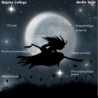
Over the last six weeks we have been working on our assignment. Which was to design and create our own desktop image. We started of by making four different ideas (you can see mine in one of my earlier posts). Using my design ideas l made a final image and it looked god awful so l made another design during the reading week. Here is how it started off...
My idea was to have a silhouette, manga style character in front of a moon in some sort of field.
I thought this design looked a bit basic and boring so l worked on it some more. This time l tried to make a more realistic sky and moon. Here is what l did...
I'm really pleased with how this turned out. I learned how to do this by watching someone make a planet in Gimp then l just changed the colour made a few tweaks using the "Warp" tool. Then l got something that kinda looks like a real moon.
 Now moving onto the character in google images l found a picture of a samurai that looked awesome. Only problem was in the image he was just stood up straight and l wanted him to be running across the picture. So using the image as reference l sketched a few rough ideas of different poses. Then worked on a final design it took me a few tries but eventually l did something l was happy with.
 Then l added the character and background together tweaked the brightness worked a bit more on the night sky then l was finished. Ive really enjoyed working on this assignment and hope my work is to a good enough standard. Feel free to put what you think in the comments thing not enough people do that. 


Very nice matey, just put in the Shipley College logo and that's it. A fine piece of work indeed. :)
ReplyDeleteI personally like the original one with the college and media suite text of the new one. Also lad you need the college arch as well, think Mel said that was quite important.
ReplyDelete